
Member Event Design – Business Renewables Center
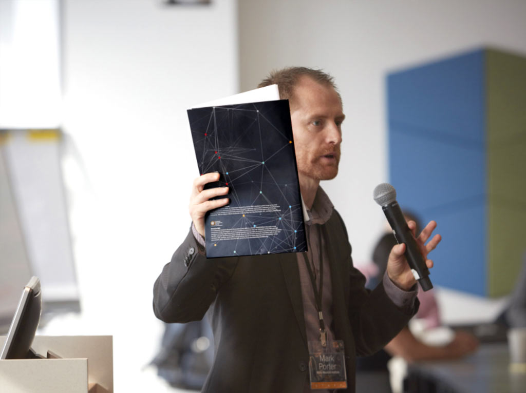
Folder in Action
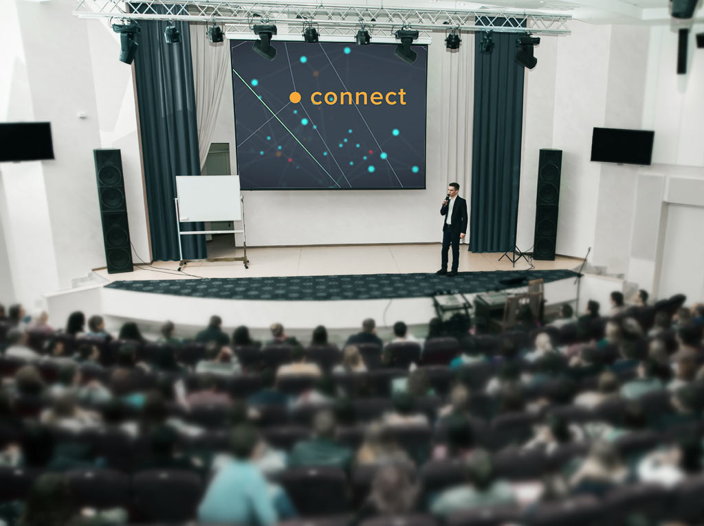
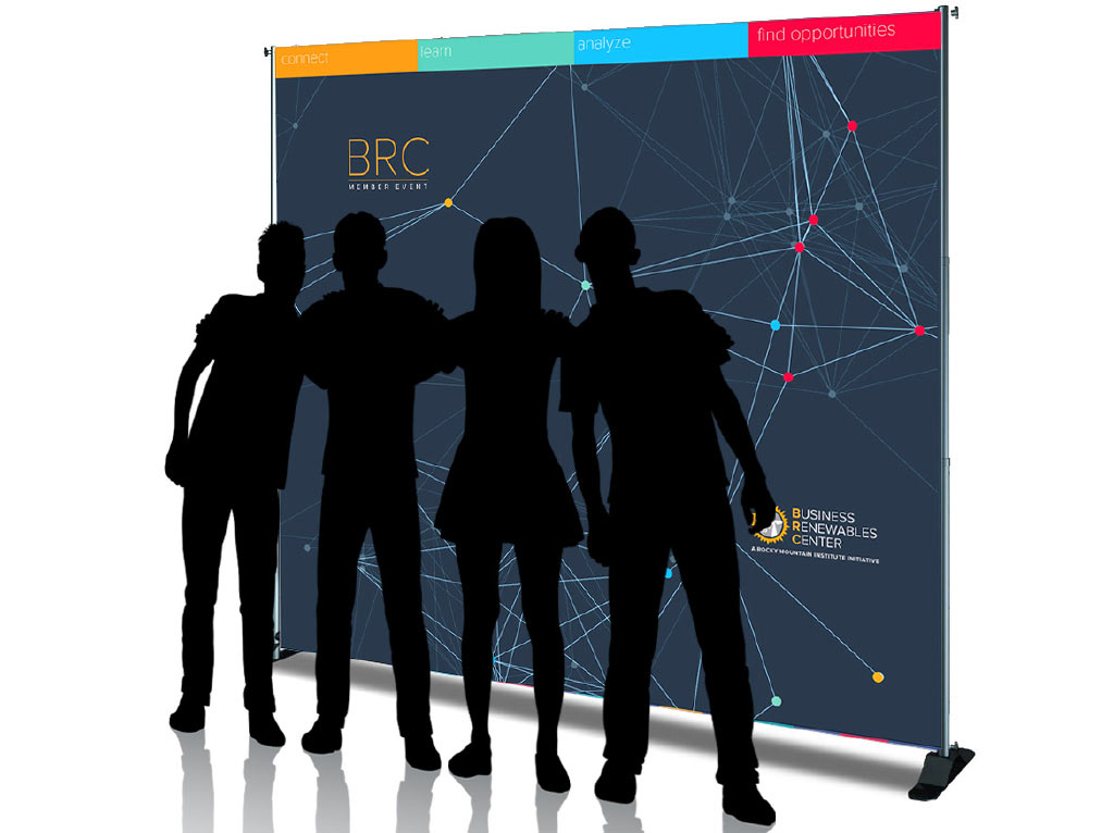
Stage background Animation showing networking structure
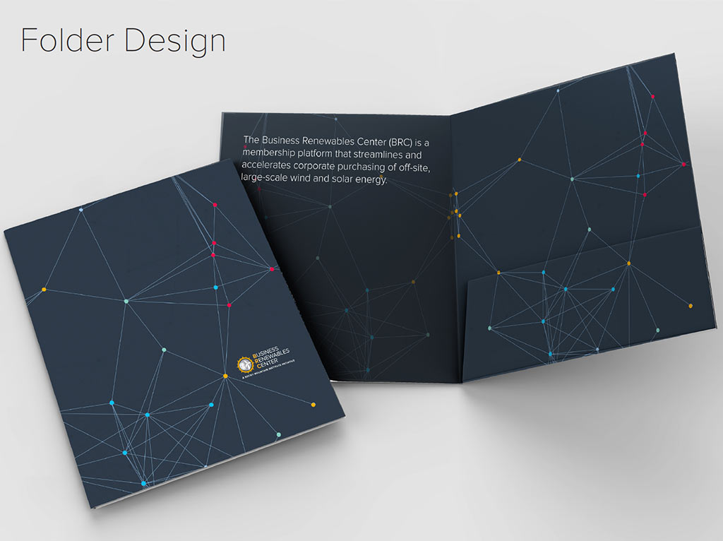
Network structure design - Folder
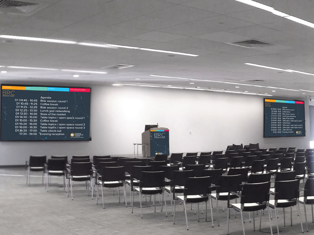
Screen conference Design
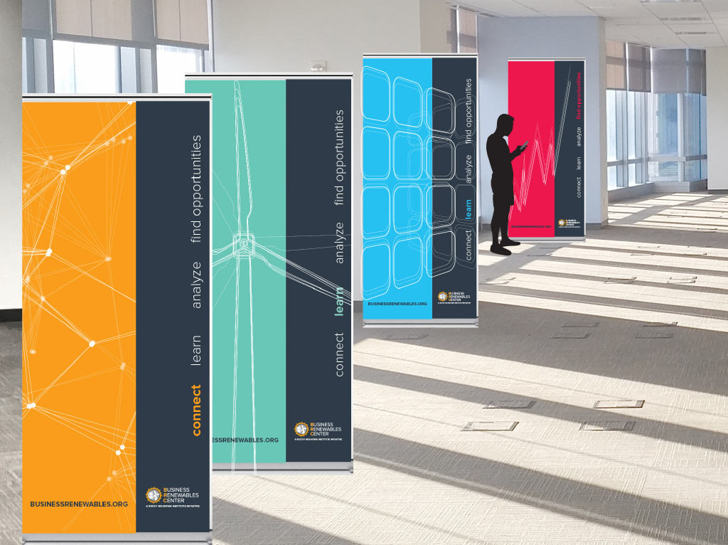
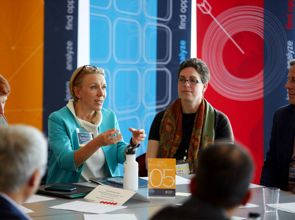
Stand up banners with network structure
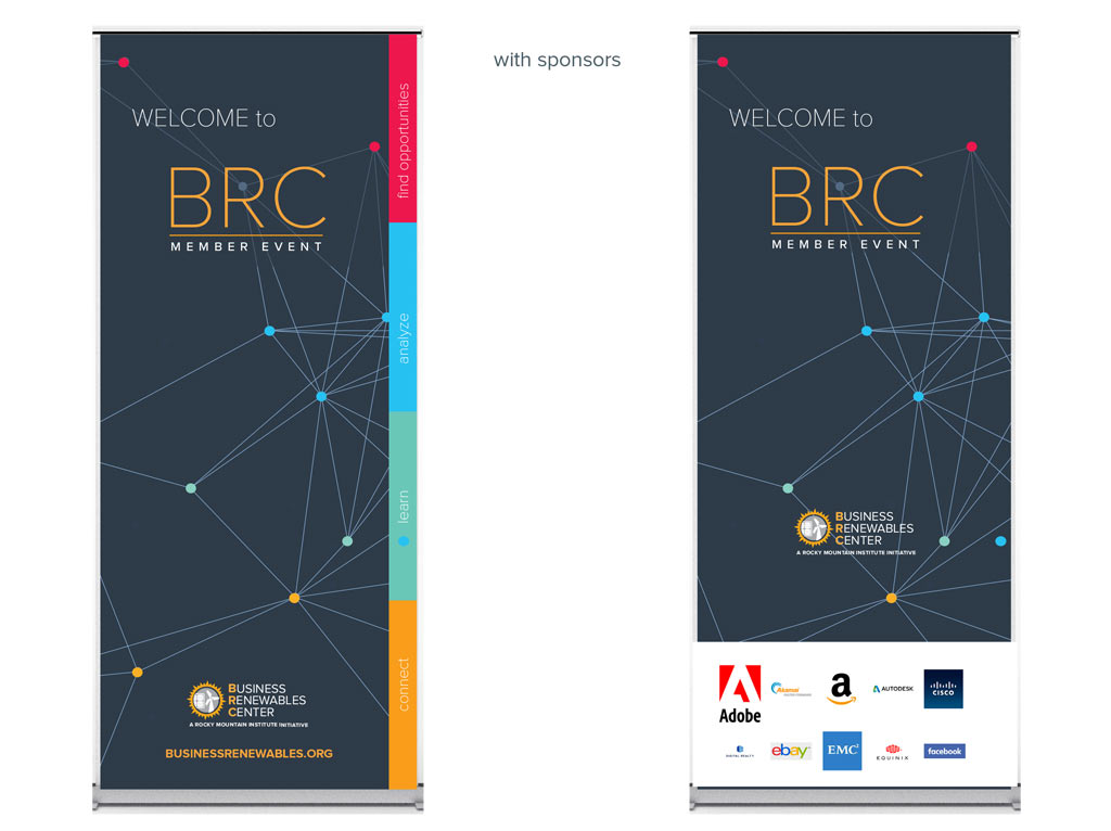
photo booth with network structure
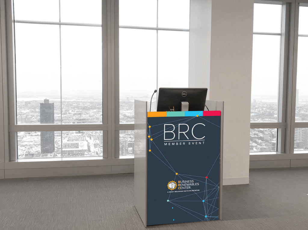
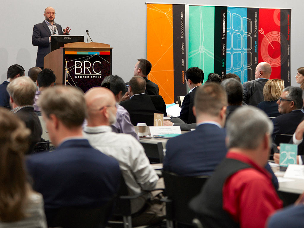
Speakers podium with network structure
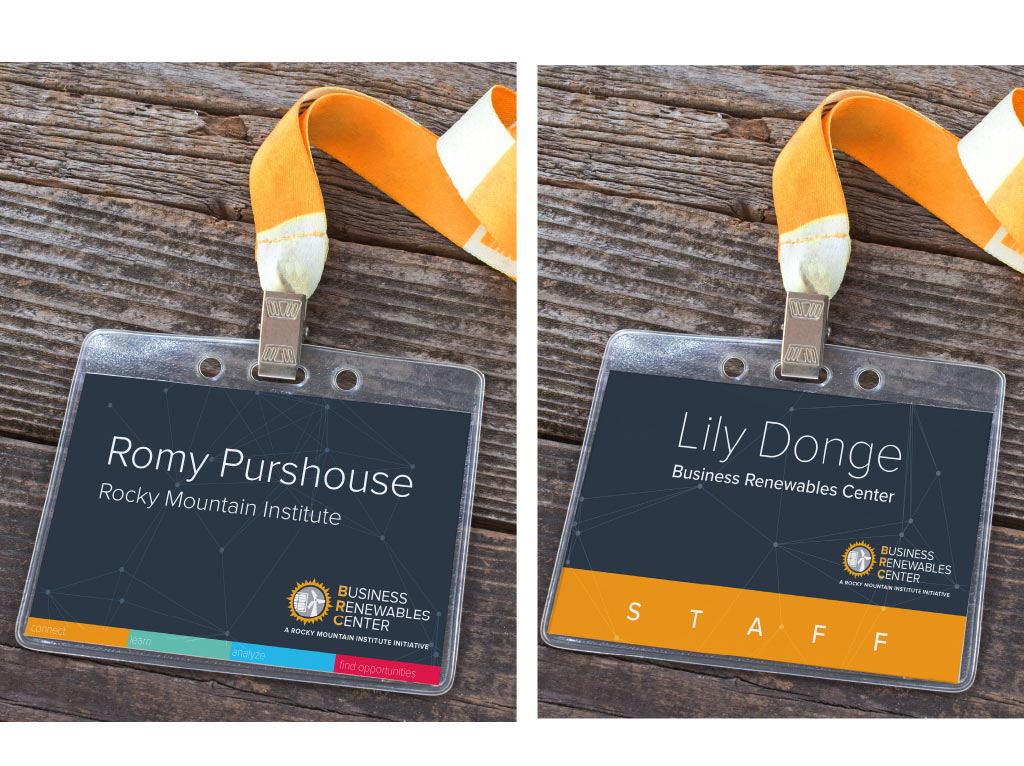
Badges
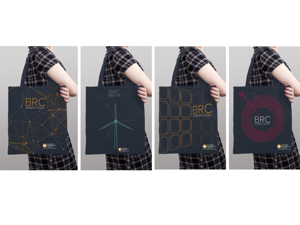
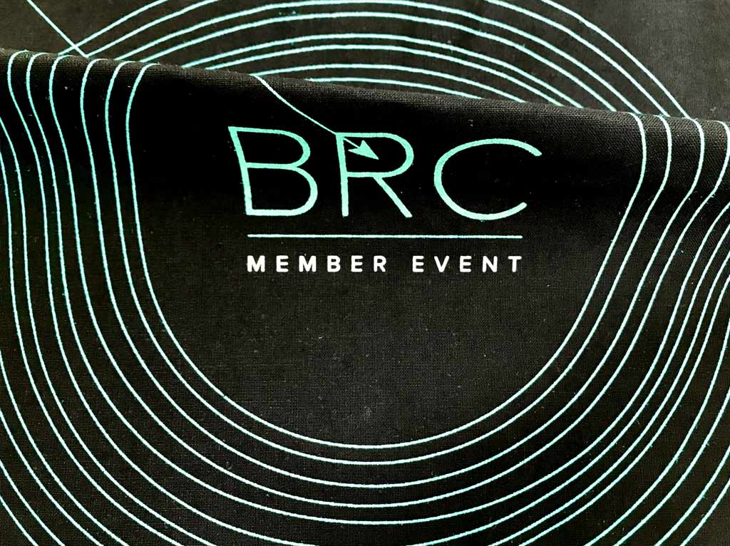
Bag Design
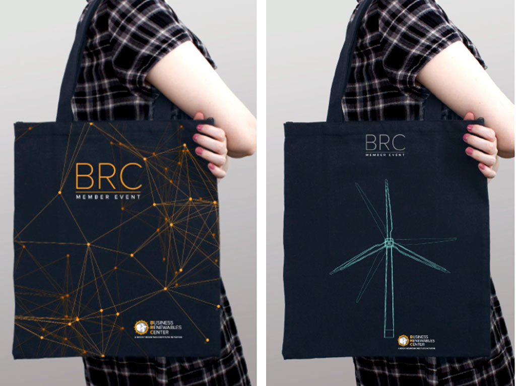
Bag Design
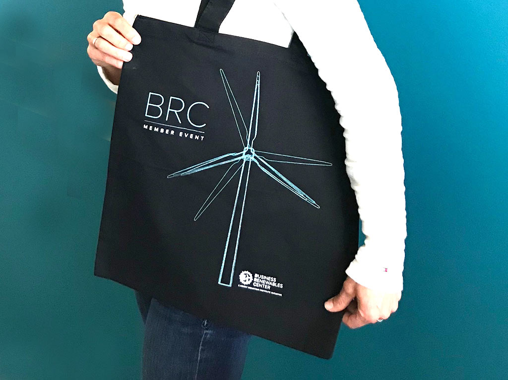
single bag
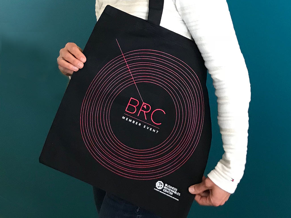
bag design: find opportunities
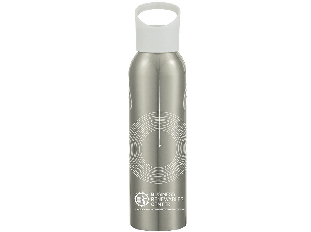
Bottle design
Large Stand Up Banners
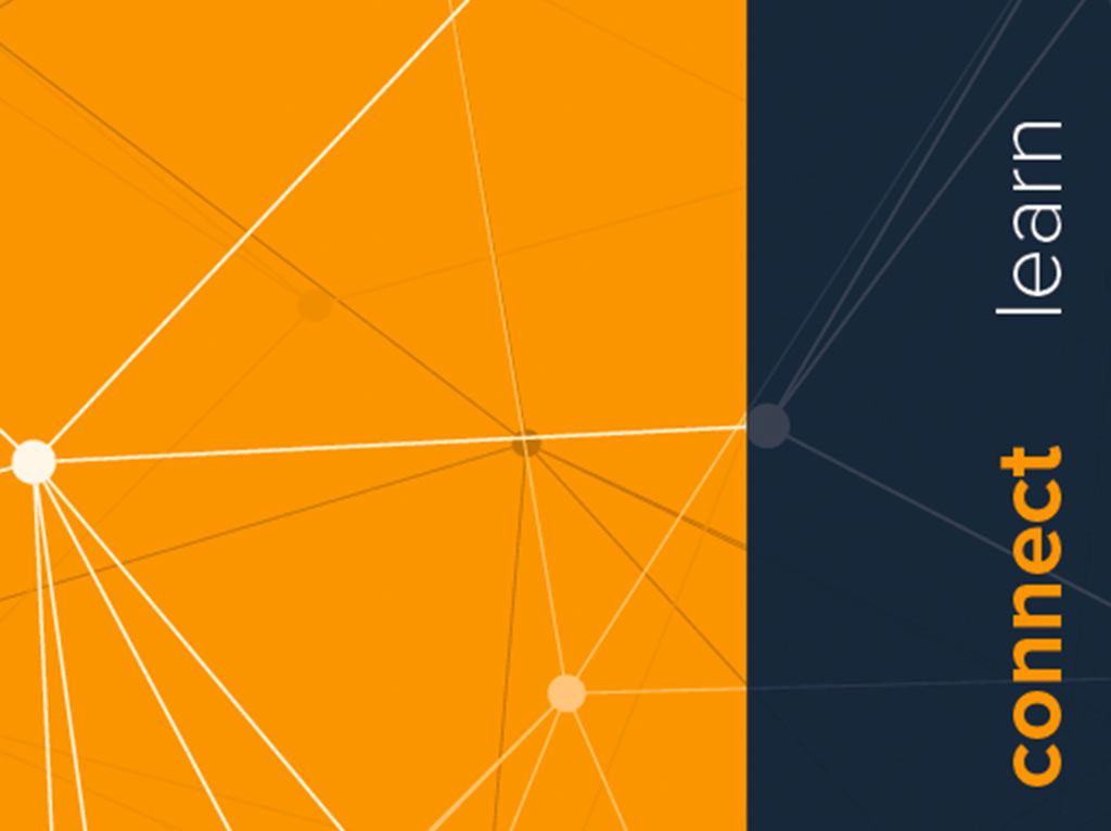
connect
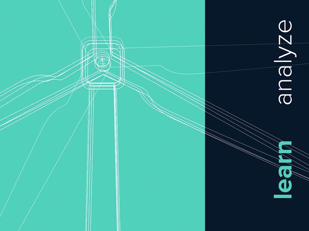
Learn
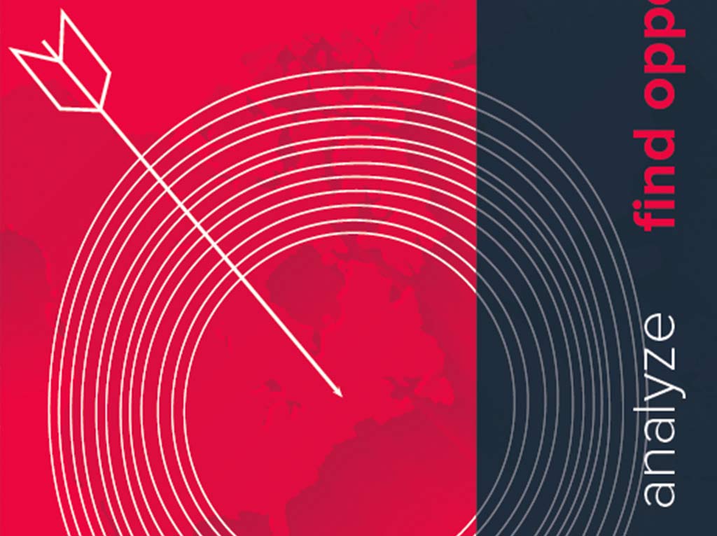
Find Opportunities
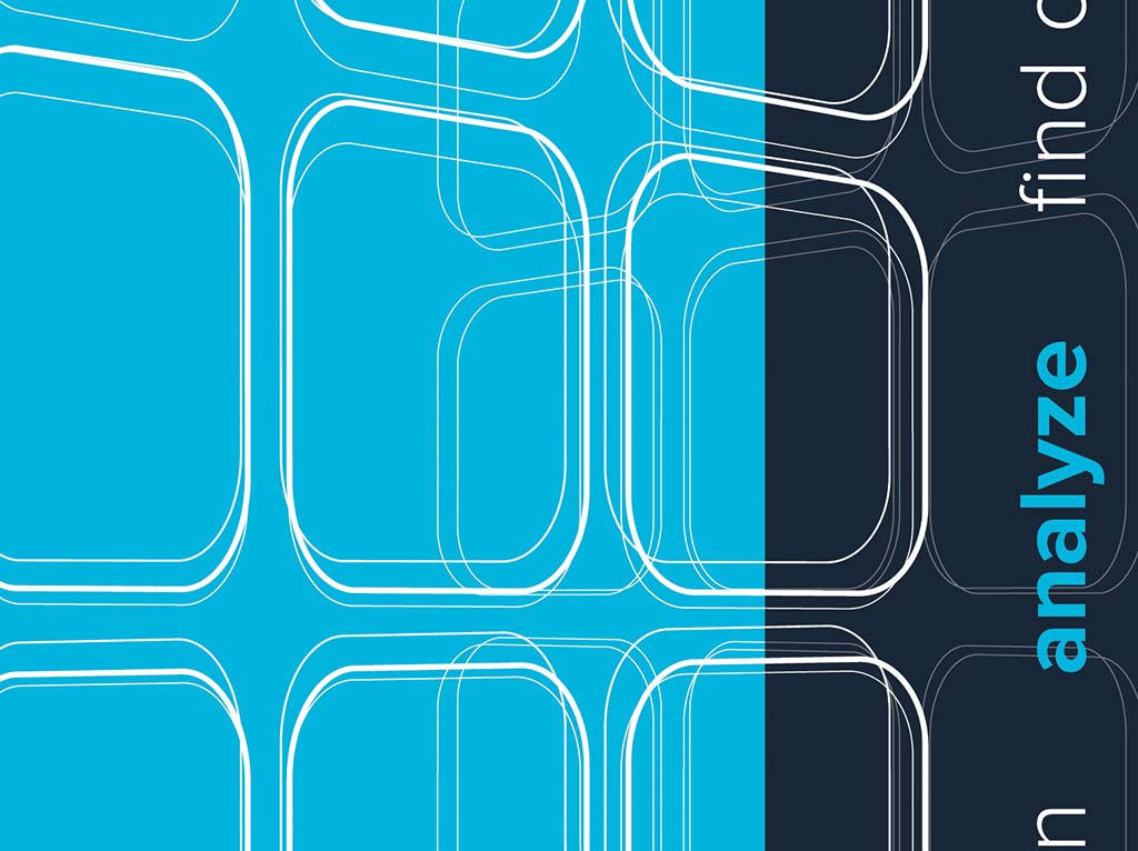
Analyze
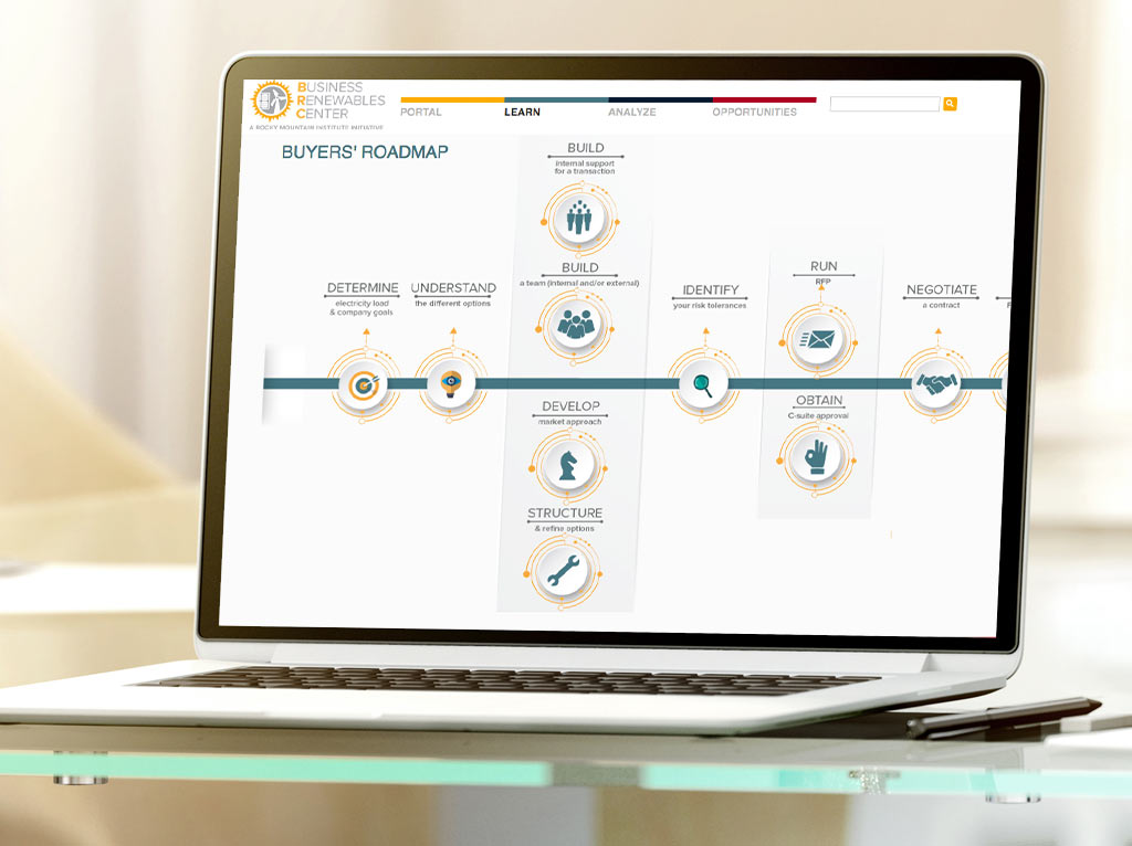
website UX Design - roadmap for buyers
website UX Design - exclusive Member platform
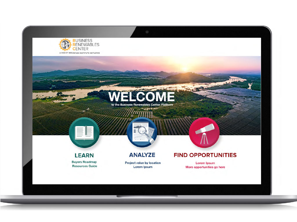
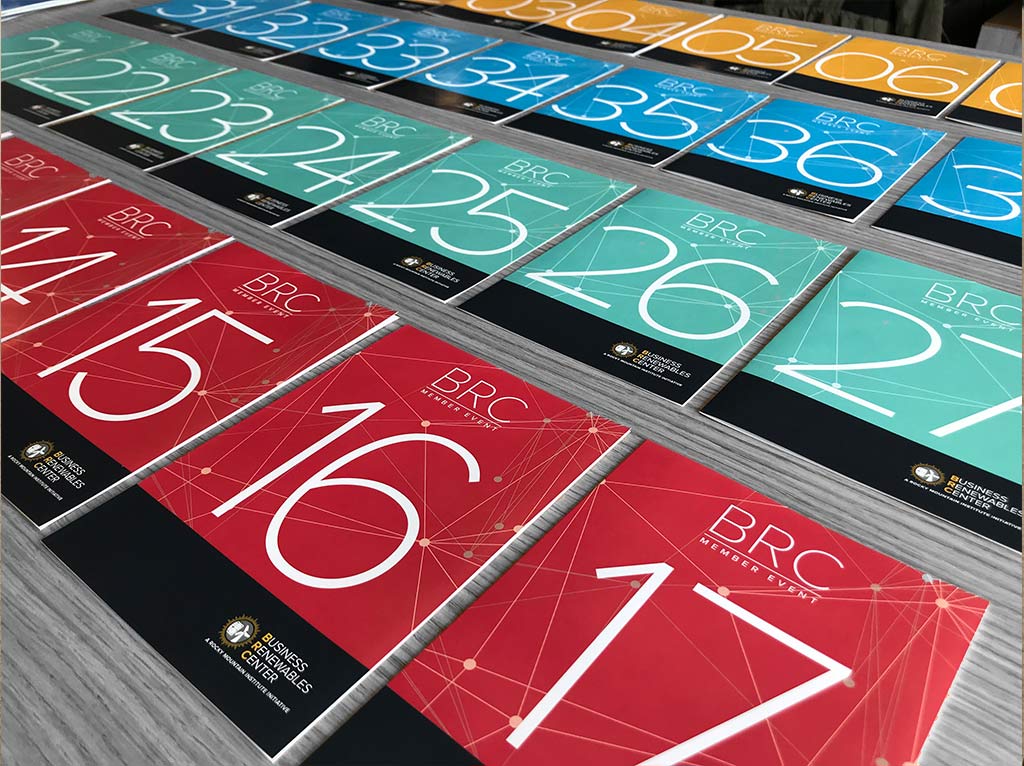
Table Numbers
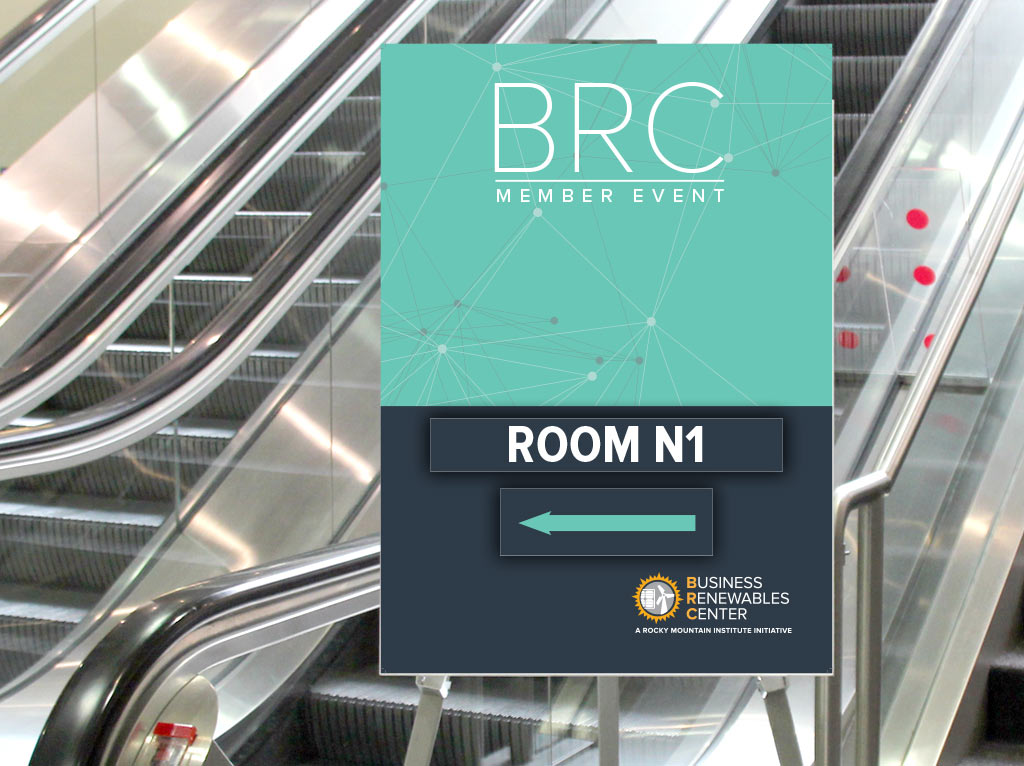
Directional Signage
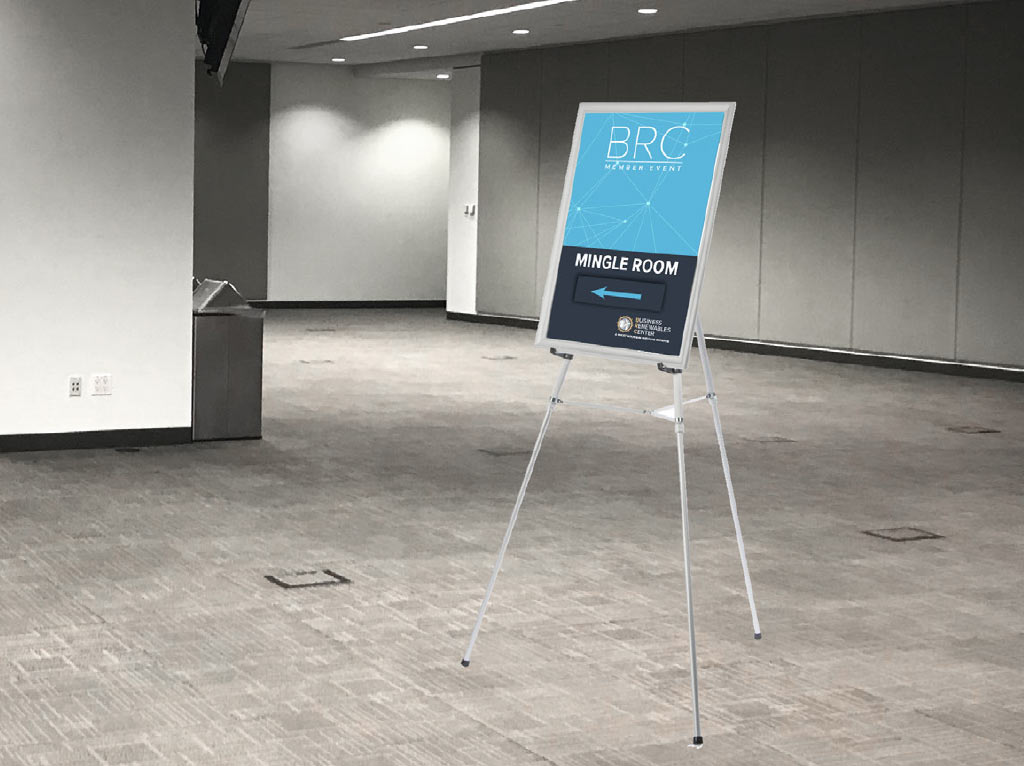
Directional Signage
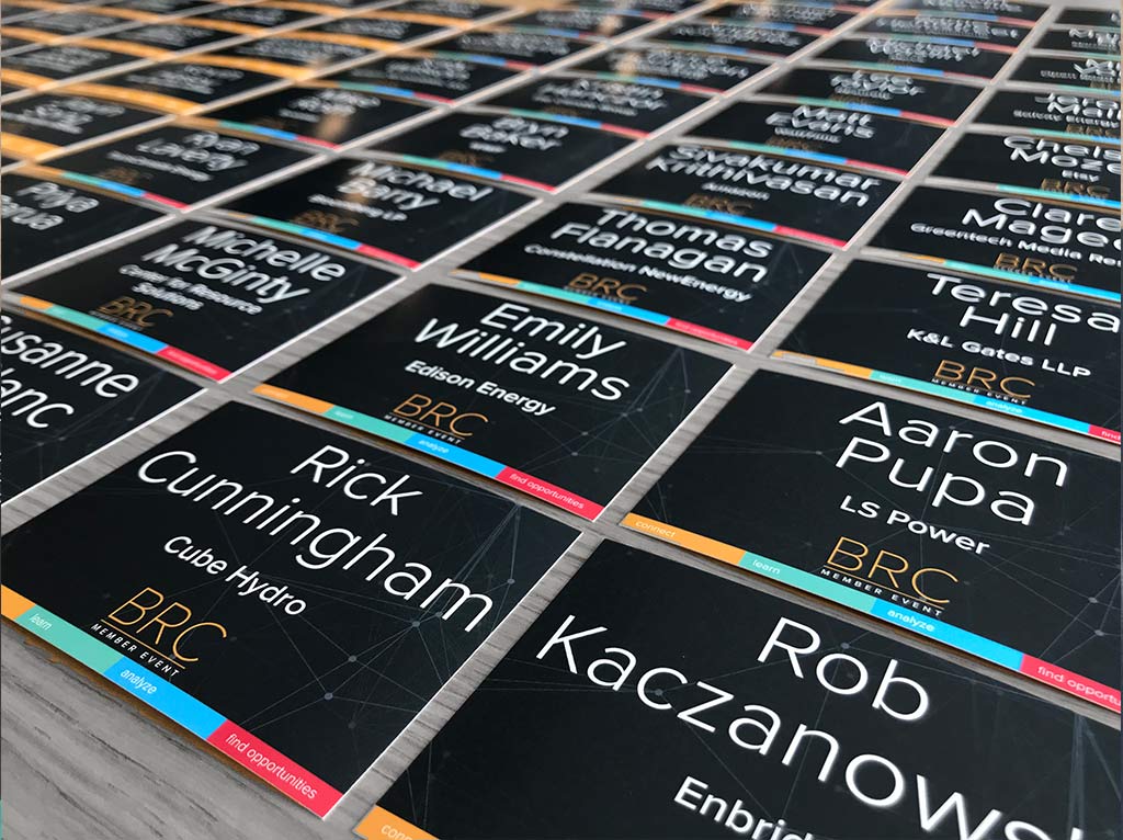
Name badges
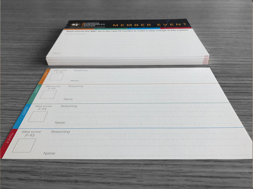
Questionair cards
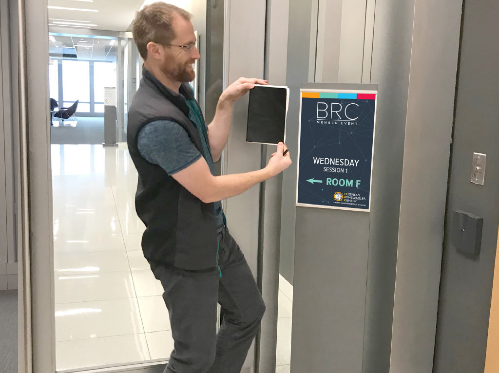
Velcro Arrow and Room Name Directional Sign
Speakers Podium Conference Room_2
Banners
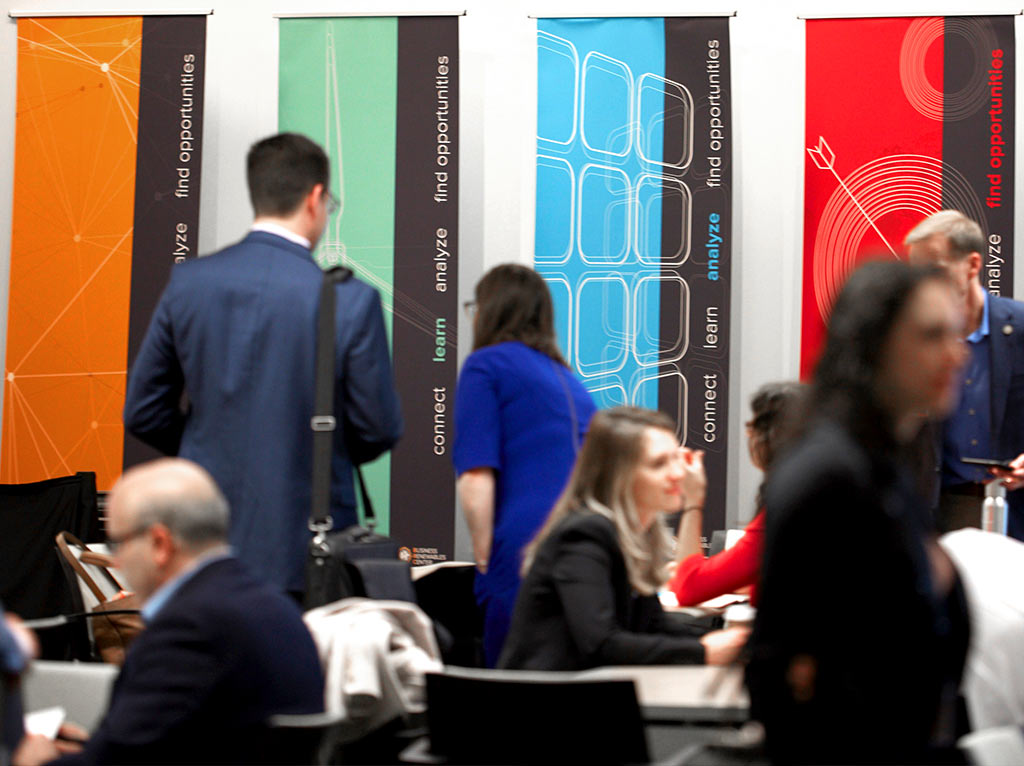
Banners during conference
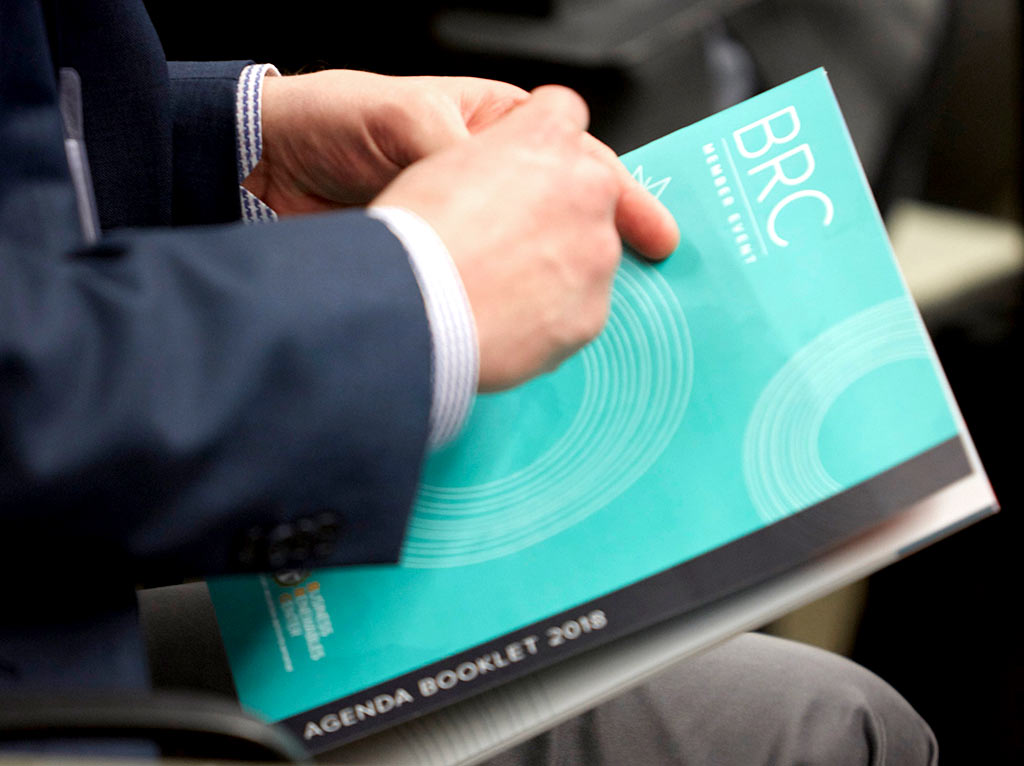
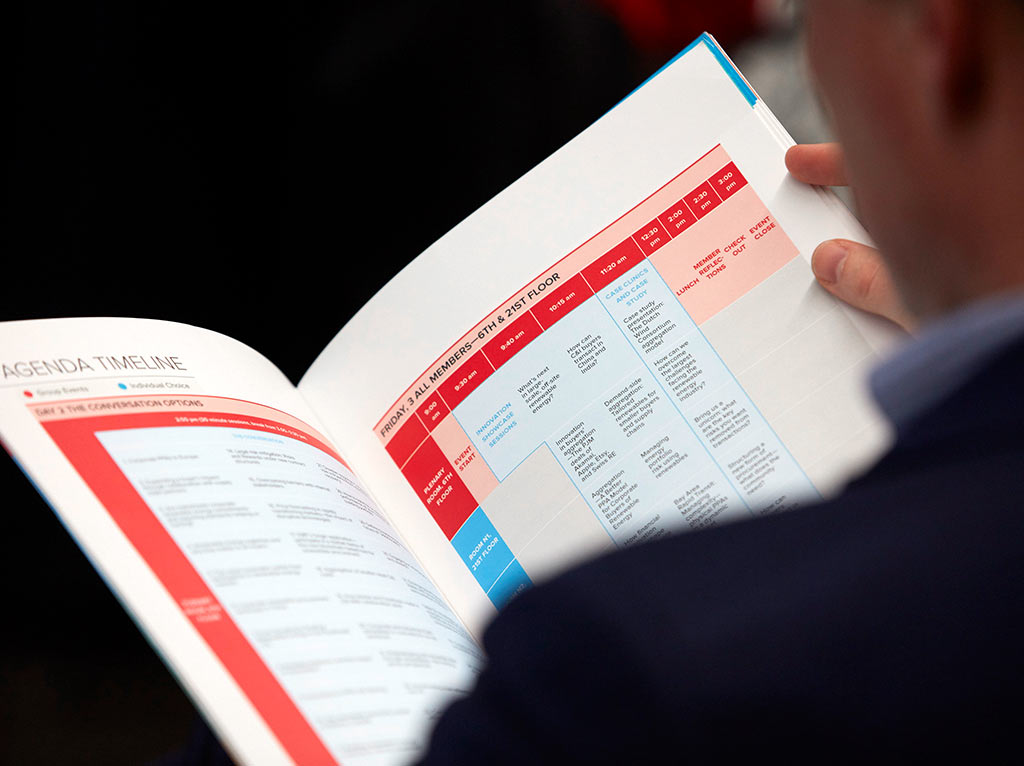
Agenda book
Agenda book in Use
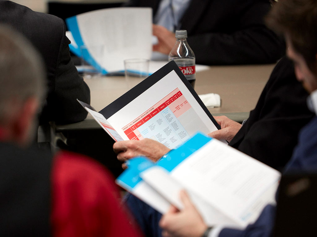
Agenda book
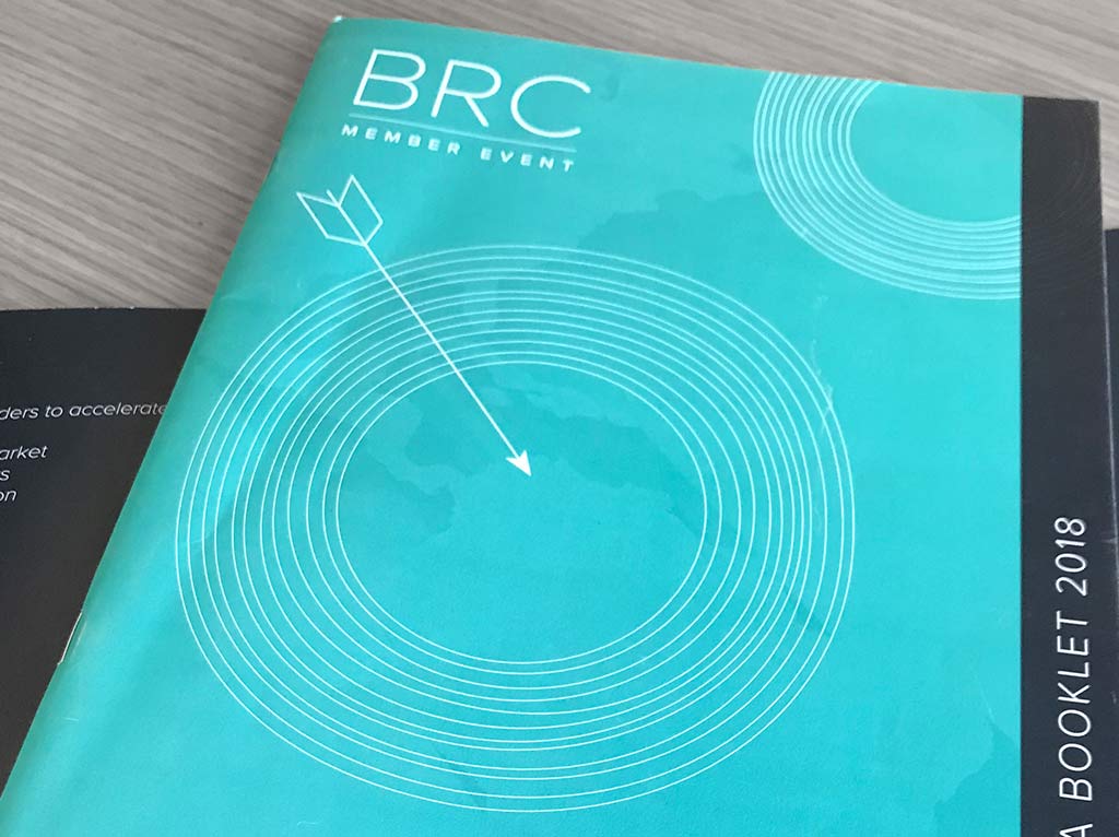
Agenda book cover
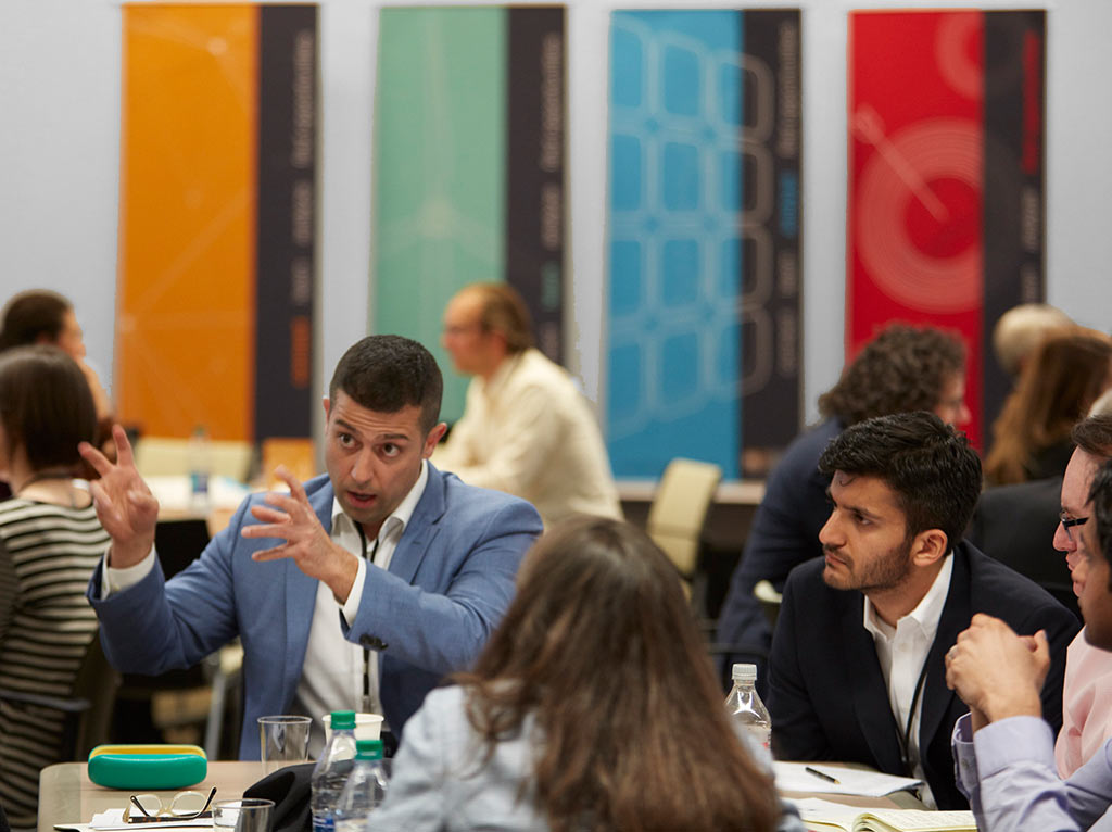
Conference in Action
About This Project
BRC Member Event Branding
For this project, I developed a cohesive and vibrant event branding for the Business Renewable Center (BRC) Member Event, centered around its core program categories: Connect, Learn, Analyze, and Find Opportunities. Since BRC focuses on connecting people, the primary design theme featured connection points to visually represent the “Connect” category.
To enhance user experience and create a dynamic, recognizable visual identity, I assigned distinct bright accent colors to each category: turquoise for Learn, red for Find Opportunities, and blue for Analyze. Each area was paired with a unique icon, reinforcing the clarity and impact of the event’s purpose.
Project Goals:
- Make the Event Attractive and Memorable
- Designed elegant, visually appealing materials that attendees could wear with pride and easily identify with.
- Personalization was key, offering attendees a choice of visuals like solar, wind, connecting, and target imagery.
- Deliver a Fun & Professional Environment
- Created an engaging yet professional atmosphere that encouraged repeat attendance.
- Create Consistency
- Repetition of the four core colors and themes from the website ensured strong brand recognition across all touchpoints.
- Every aspect of the event, from lanyards to table numbers, was meticulously branded for visual consistency and long-term brand alignment.
Deliverables:
- Digital app banners
- Folder designs
- Photobooth artwork
- Directional signage
- Event bags and water bottles
- Lanyards
- BRC animations
- Stand-up banners
- Flashcards
- Speaker podium boards
- Printed signs for SG stands
- Sponsor easel boards
- 5×7 tabletop signs
- TV screen designs
- PowerPoint presentation templates
- Website elements
- Sponsor stand-up banners
- Color scheme management
By integrating the key visual elements from BRC’s website and program categories, this project successfully established an engaging, memorable, and cohesive event experience.
BRC Event Branding
Event at Goldman Sachs New York
Date
April 2018