Folder Design
Date
2014
Category
Branding, EventsAbout This Project
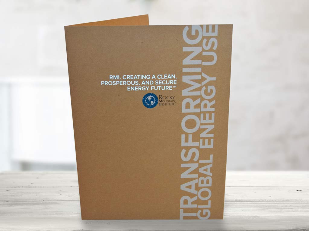
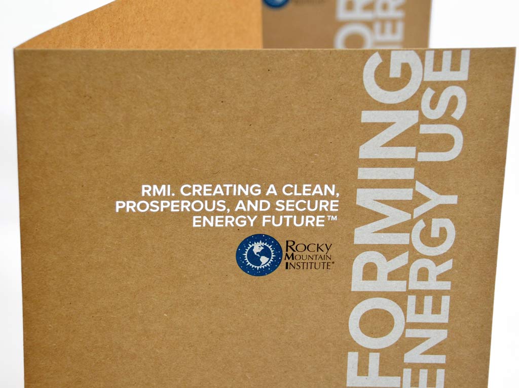
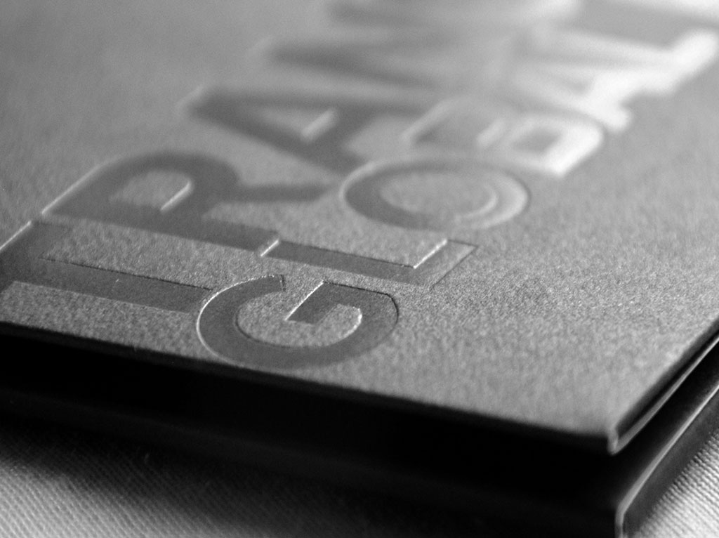
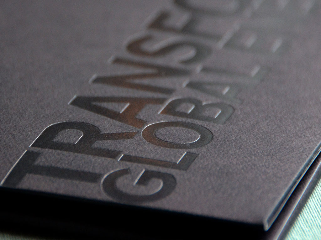
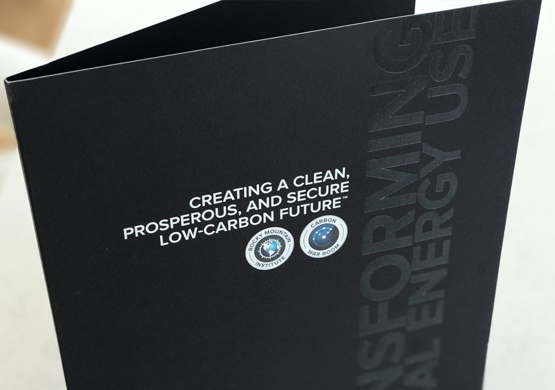
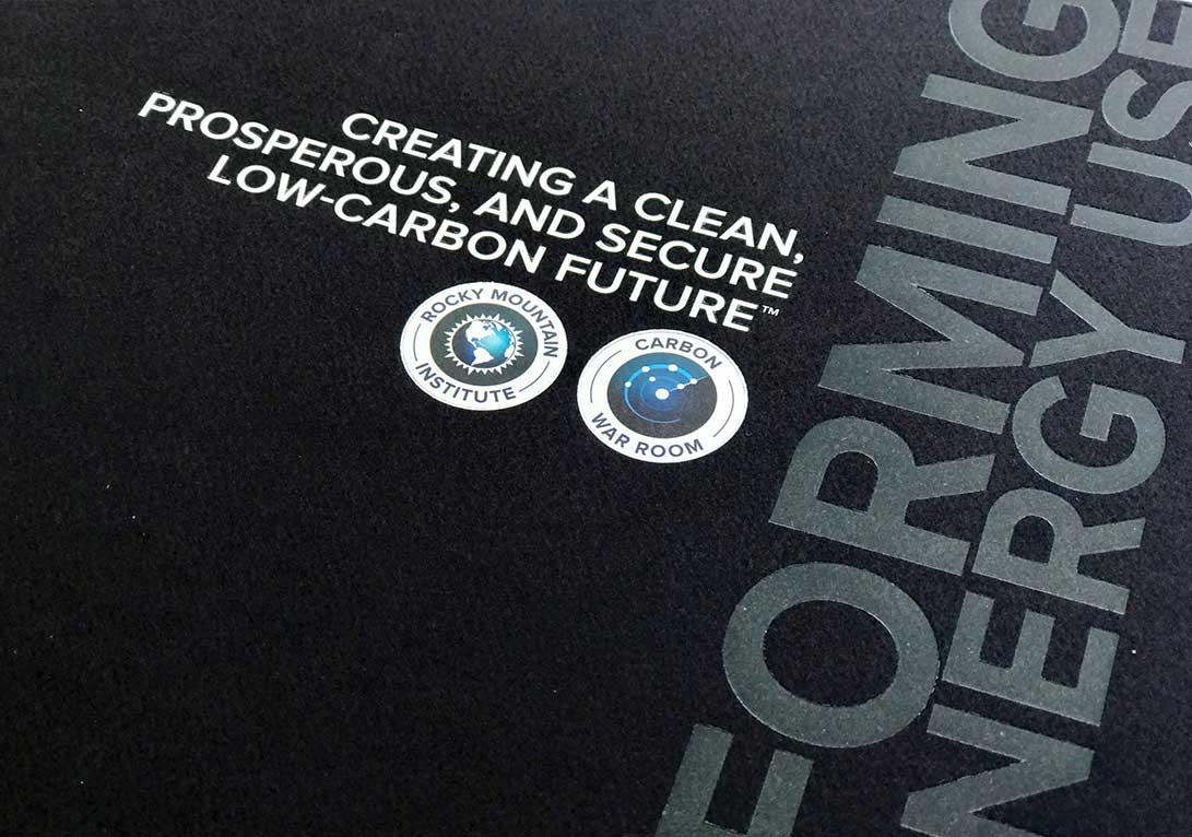
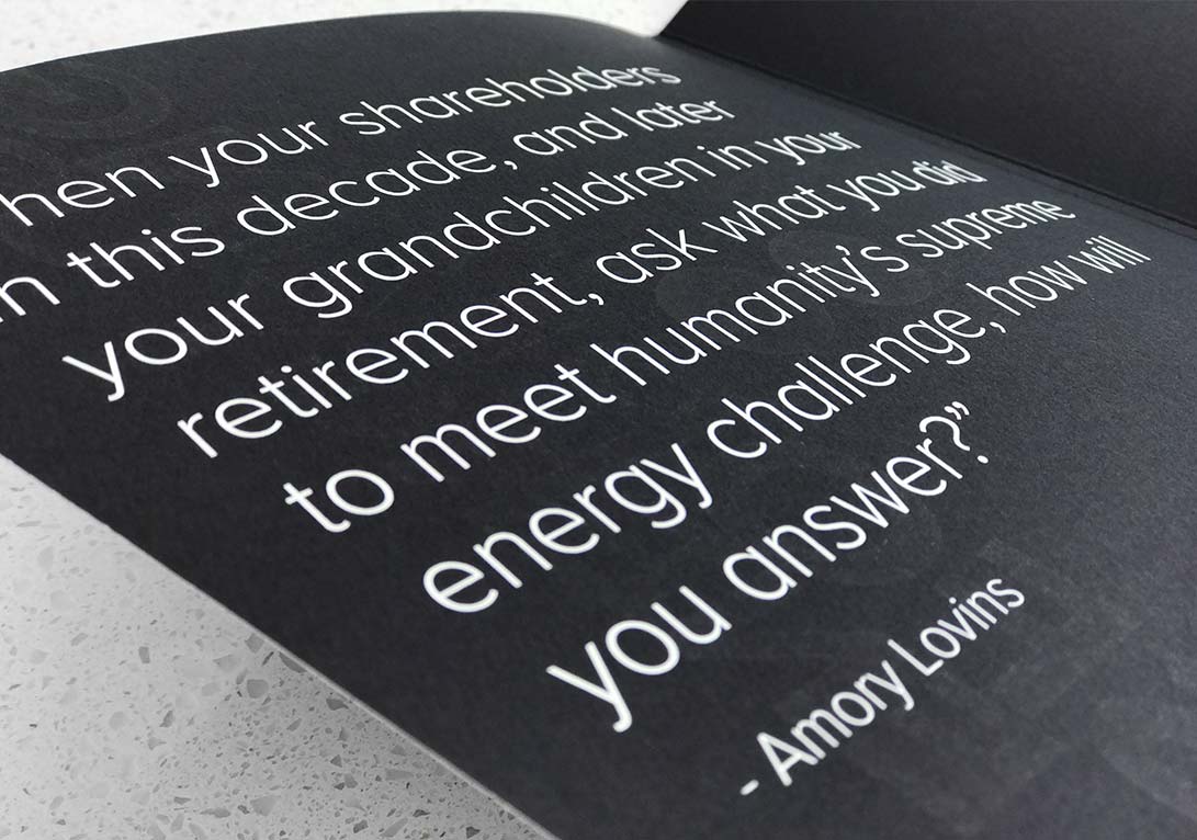
I designed this branded folder in 2014 and then re designed it in 2016. In 2014 I chose a rough recycled paper and contrasted it with a white foil treatment of large typography displaying Rocky Mountain Institutes Brand promise. This purposefully recycled look underlined the sustainability and content of RMI’s brand promise. In 2016 I went for a more sophisticated textured dark paper choice with a transparent foil and silver ring foil treatment around the two logos. The second folder was a custom build to hold some materials on the left with a vertical and horizontal business card slit and to hold more materials on the right.
